Brand strategy / Creative direction / Design / Art direction / Copywriting
Brand identity / Literature / Video / Web design / Advertising / E-marketing

Context
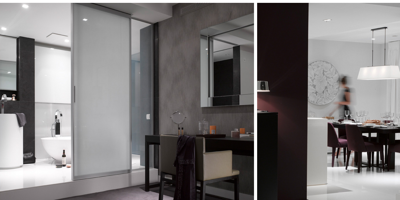
Pan Peninsula was an iconic Docklands residential development: the tallest, the most luxurious and the most expensive. However, uncompleted by the economic crash, in 2008 the premier apartments between floors 34-47 were withheld from sale. With the resurgence of the market came the requirement to breath new life into these properties. But with a building, brand and story that came to be seen as a symbol of the downturn, and with new competition springing up around it, how could Pan Peninsula be 're-sold' to the wealthiest and most status-conscious customers?
Solution
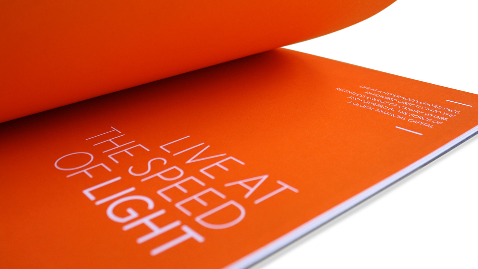
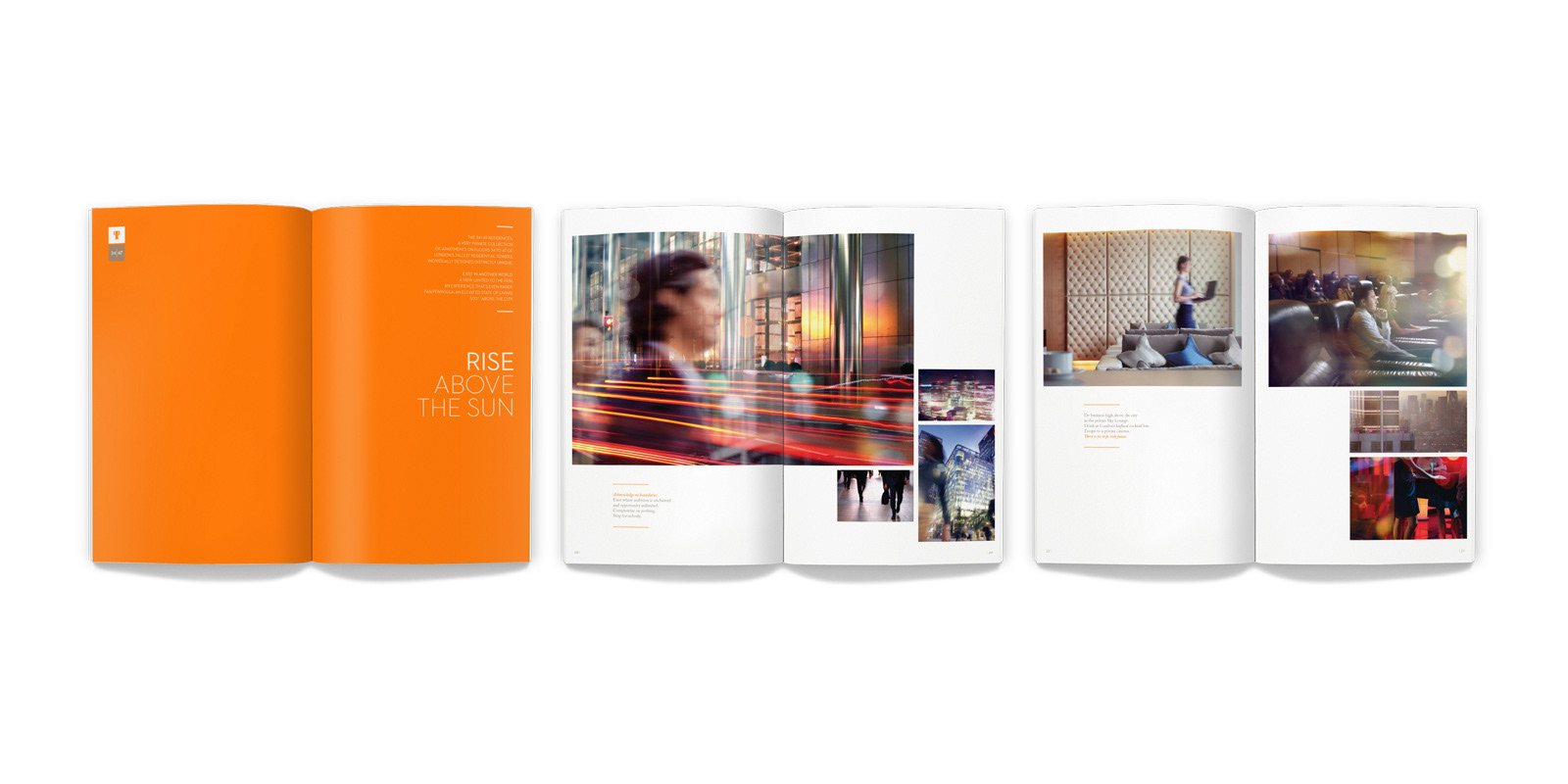
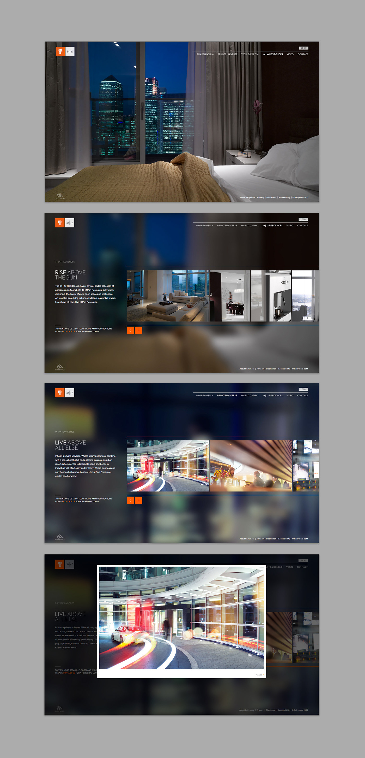
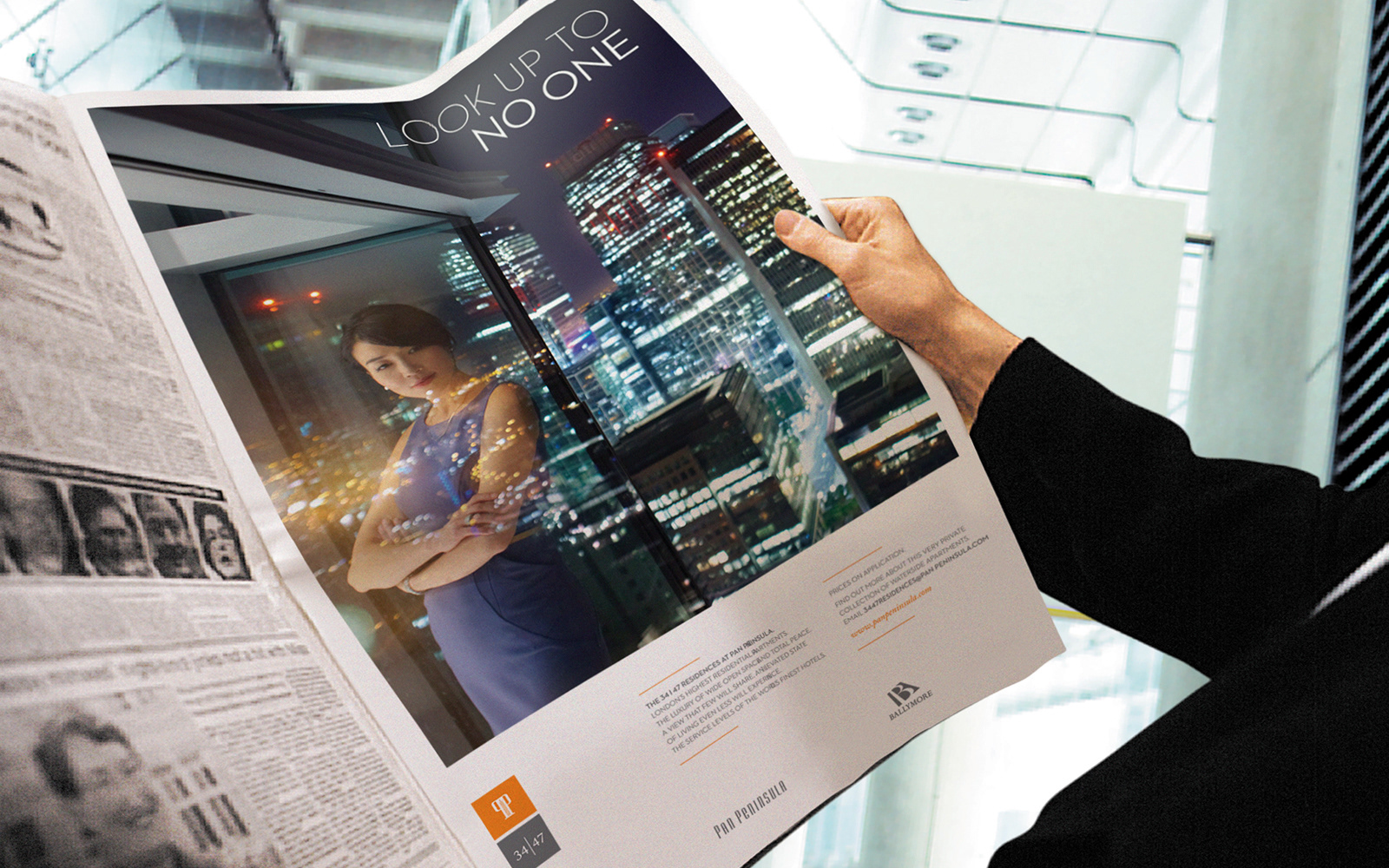
The ‘honey pot’ strategy made unapologetic capital of the property's still unique attributes – look up to no one. Appealing emotively to those who seek to gaze down upon the seat of true wealth and real power, this was a home of new gods. Within this ‘Olympus’ you become part of an iconic skyline. And like a god, you rise above the sun.
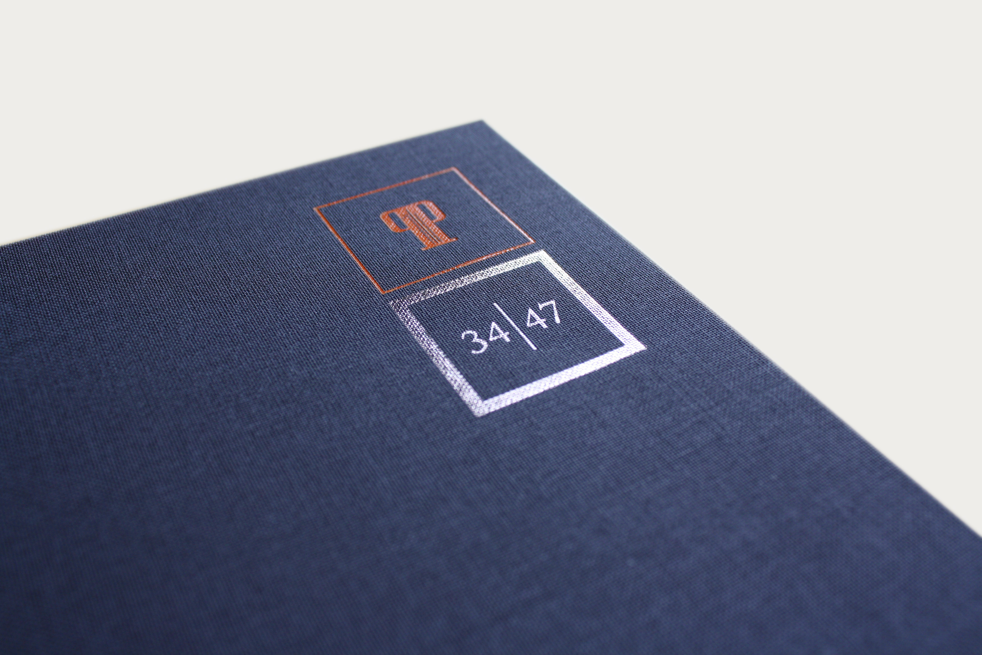
By reducing the way we used the building's name to its symbolic monogram, both visually and verbally, it was possible to change the language around this tranche of properties, introduced only by their own sub-brand – 34|47 – encapsulating everything that made them exceptional, devolved from preconception. Every one of the 34|47 apartments sold after launch.